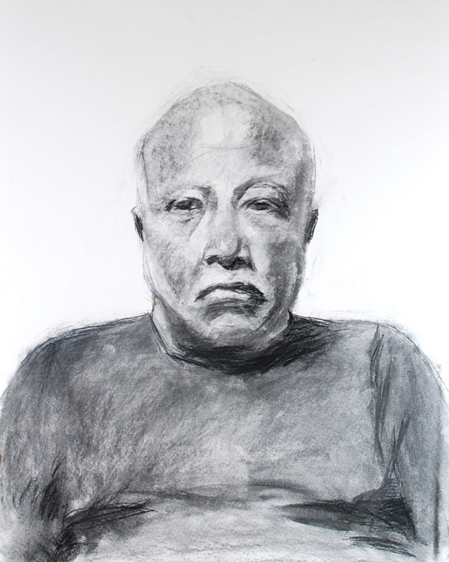
Sometimes I'll return to a homework assignment to complete it if I've run out of time, or push myself a little further if I feel there is more to explore. This was the case with a primary palette homework assignment given by Anne Petty this quarter. We were asked to paint two loose reproductions of a master painting using different primary palettes. We could choose from three self portraits by Catherine Kehoe. I chose this one because the brushwork and color combinations seemed the most challenging to take on.
 |
| Original Image by Catherine Kehoe |
With the first palette, I was unable to get really satisfying red-violets. Having alizarin crimson available in the second palette felt wonderful, but with yellow ochre as my only yellow, I was unable to get the chartreuse colors with the second palette, and chose to strive for a rich gold as a substitute.
I spent quite a bit of time on these, making three or four passes on each. I was fascinated with Kehoe's sharp, flat brushwork, and tried to mimic her shapes and strokes as much as her colors. My favorite part is the collar. I love the structure and solidity of it.
Julie Devine, Kehoe after Kehoe, Palette 1, 2011
Oil on Board, 12" x 9" Palette 1: Titanium White,
Burnt Sienna Cad. Yellow Light
Ultramarine Blue

Julie Devine, Kehoe after Kehoe, Palette 2, 2011
Oil on Board, 14" x 11"
Palette 2: Alizarin Crimson
Yellow Ochre
Colbalt Blue
B. Sienna Titanium White
> |